
Friday, 23 January 2015
GOODBYE BLOGGER!!!
The time has come for me to say goodbye to Blogger. Its crazy to think that this will be the last past I will EVER make on this account. The journey has been a ROLLER-COASTER! From the time at the beginning of the year where I couldn't keep up with my bogging, to scheduling when and what I will be posting blogs. All in all, I wouldn't have changed the journey for anything as it has taught me so much as a person. Starring in the music video for my group has built my confidence and presenting the pitch to the class enabled me to see my capability in speaking in front of groups of people. My skills compared to those I had in the AS year have developed immensely. At times I have given up on Blogger- but now I can truly say I am going that it is going to be a weird feeling not having to log on to this account any more. To the teachers that provided feedback that helped motivate me to get to the stage of making this final post- I salute you! BYEEEEEEEEEE!!!!! xo
Thursday, 22 January 2015
Wednesday, 21 January 2015
EVALUATION QUESTION 3- how did you use media technologies in the construction and research , planning and evaluation stages?
to create the anamatic we used final cut pro. we took the pictures from the anamatic:


Evaluation Question 3


CONSTRUCTION
Final cut pro- base track editing. Here is the process we used to have our shots change to the beat of the song without marking each clip individually. Music videos always have shots changing and with final cut pro I was able to do so.
ANIMATIC
To create the animatic final cut pro was used to bring the concept of our music video to life.
Tuesday, 20 January 2015
Evaluation Question 2

Here is a mood-board I created that create links of my music video and ancillary to real music videos and ancillary:

Monday, 19 January 2015
Question 4- Planning
What have you learned from you audience feedback?
ROUGH CUT FEEDBACK
MUSIC VIDEO SCREENING- REACTION- RECORD THE AUDIENCE REACTIONS
ANCILLARY WORK- WHAT THE AUDIENCE THINK ABOUT THE DIGI PAK AND THE ADVERTISEMENT
Question 2- Planning
How effective is the combination of your main product (video) and ancillary texts (digipak)
What aspects of the video link with the Digipak and Advertisement?
How can your audience recognise them as linked products?
How can your audience recognise them as linked products?
How successful do you think your main and ancillary texts are?
Do you think your target audience would be attracted to them? If so why? If not, why?
Compare with existing products to illustrate how you've used synergy.
Do you think your target audience would be attracted to them? If so why? If not, why?
Compare with existing products to illustrate how you've used synergy.
*Compare the music video and Digipak and Advertisement
*Vlog- Camtasia
*Vlog- Camtasia
*
Question 3- Planning
How did you use media technologies in the construction and research, planning and evaluation stages?
*Research- Blogger- Slideshare- Vlogs,
* Planning
*Evaluation
Final Cut Pro- Editing
Photoshop- Digipak- Advertisement, draft version of digi pak
Youtube- Ideas for Music Video
Prezi-
Timetoast
Slideshare
Powtoon
Voice recordings
Emaze
Power point
Bubbl- skills development
Clipgrab- download music file for music video
Brainshark
WIX- wesbite creator- pitch
Murally -pitch-Q5
Email- sent email to record label
Vimeo- embeded video
analysis of ancillary work
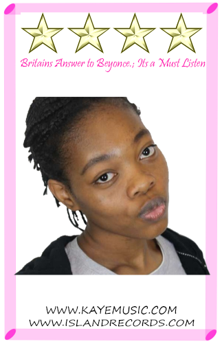
overall i am happy with the outcome of my ancillary work as i feel like the cover and advert were good representations of an album cover and an advert of the pop genre. i feel like the album cover would personally really attract me as the photo that i used on the front cover is very striking as the artist is looking directly at the people who are looking at it, this is important as the audience can familiarise themselves with the artists face. also the fact that the artists is not covering her face in the pictures suggest that she is confident, which is an important message to send to the younger target audience that she has as many younger girls have problems with the way they look as they reach a certain age this is the same with my advertisement as i used the same photo. i believe that i use synergy as well as i the photo KAYE is wearing hoops and a hat which she wears in the video that we shot, helping the audience to make a direct link between the album cover, advertisement and music video.
the back of the album is the back of the artist, i do this to present the idea that KAYE has a different side to her in terms of the music she creates. the fact that the font on the cover is not as bright and eye catching like the typical pop genre album cover suggests that this may attract a wider audience than previously suggested, which was 13-18 year olds, so this may attract an audience of people in their early to mid 20's. i used the back ground from the image that i took as i feel like it gave the whole cover an urban vibe, which also makes it familiar for those who pick it up as London is full of parks with buildings in the back ground also the contrast between the greenery and the buildings also shows the contrast between KAYE'S songs.
the positioning of the words was is very important in an album cover and advertisement, as that should be the first thing that the audience see so that they know who the artist is and what the album is called. i placed my text in the top centre of the cover as i feel like what ever is placed there is the first thing that anyone will look at when looking at an album cover. the font that i used for both the name and album name are very eye-catching and compliment each other well. the name of the artists is a much bigger size as i feel like that is the most important piece of information that the audience need to know so that they can remember her name and tell their friends and family about her :).
one thing that i definitely regret is not taking more photos of the artist in a different style as all my pictures that i chose from where in a similar pose which led me to run out of ideas of what to do with the inside of my album cover as i had such a clear view of what i wanted to do with the outside.
Sunday, 18 January 2015
Saturday, 17 January 2015
Friday, 16 January 2015
Analysis of my ancillary work
Overall I am happy with the outcome of my ancillary as I feel it represents the connotations that come with POP album. For starters, the bright colours catch they eye from a distance away, which is important if this is to be put on a shelf with other musicians. I believe that I have used synergy well, using the hoop earrings as a motif to the audience. Furthermore the black hat and black used in the title 'WHO YOU ARE' adds dimension to the artist, as it presents the possibility of 'Kaye' having an edgy side. This is something I was adamant on doing as although primarily targeting teenagers (13-18) the slight use of dark colours can appeal to those slightly out of that market, such as 20-24 year old. I've kept the background white as I first wanted to emphasis the use of bright colours. When positioning text on the album cover and advert I always kept in mind using extra space. For example with my advert the picture took up the majority of the left side and instead of adding text to the left side, I concentrated on doing so on the right side. I believe this gave my advertisement a more professional feel as everything was placed so that the audience could understand clearly as to what was being advertised. I also made sure that I did not put text where it already was and used the space I had well enough to make sure there wasn't any awkward space. The placement of details as to where it would be available and where to find the advert I feel added to the professionalism of my advert.
As mentioned previously I was having difficulty with what to place on my digipak. I had the urge to add a picture for all panels however I refrained myself from doing something that would possibly ruin the outcome of my digipak. I stuck with using two pictures, one in the front that began on that was placed to the right and made its way to the back of the CD cover. My initial digipak mentioned using light to create a spotlight effect, which I stuck to which gives a nice contrast to the white focused in the middle of the outside panels. For the inside panels I used the same concept as the front but put the picture on the left so that it would gradually go white for the CD to be placed on the right. The subtle transition from being a part of the photo and then fading into white gives it a natural element.


Thursday, 15 January 2015


ancillary check in
I must admit I been having a hard time trying to finish my ancillary work. I have been overwhelmed by the good work produced by my classmates that I have started doubting mine. This is unusual for me as I usually am always hopeful that it will turn out how I wanted when it is finished. At this point I am constantly looking for reassurance in the 'do's and don't' of ancillary work to make sure I have all of the do's in my work.


final ancillary editing
I have not changed the positioning of the magazine advert. I have used the rule fo thirds to make sure that the la
Wednesday, 14 January 2015
final editing and update on ancillary work
i don't have a lot more to do of my ancillary work! all i have to do is add the finish touches to my advertisement e.g social media sites to find artist on and also i want to add information about the record label that she is signed to. another thing i have left to do is to figure out what i want to put on the CD its self as i do not want to leave it blank, i also need to put all the information that needs to be on the CD on it. so far I'm really happy with what I've got ! :)

Possible album covers
I have played around with the initial idea of the layout of my album cover to create possible album covers.

Here is the first album cover I have produced.I am yet to add the artists name as the font I plan on using is not installed into the device I am using to edit outside class.

All that is left to be done for my magazine advert is add the name of the artist, and an image of the front cover of the album.
The inside of my album cover will be very simple. it will include a different image of the artist that covers both panels.
location for ancillary photos
the location i am using for my photos is in a very urban area as you can see the buildings in the background however the greenery in the background also gives a contrast to the photo. i did this so that the audience could see that my artist is very border line between contrasting genres. the 'feeling' that her music gives is also different with each song some songs make you want to dance and jump and others make you feel more emotional. i got the inspiration for the picture from Lana Del Rey's album cover for 'Born to die'.


blogging health check 3
my blogging health check went alight as i am now a better grade than i was earlier on in the year which is a good sign as it shows I'm improving.
the one main problem that I'm facing when it comes to blogging is being on time with the blogs and also making sure i have all the right blogs up and ON TIME!
these are the blogs that I'm missing in order to get my grade up and Ive done some most of them now :)

Tuesday, 13 January 2015
using youtube to help me with photoshop
I've always found it really hard to use a computer properly let alone photoshop so i took to youtube to help me. for example one thing that youtube really helped me with was how to fade two images together which i needed for the front and back cover so the lines between them were not so harsh and so they blended perfectly with each other. this is the video i used to help me:
mock up of advertisement
this is the poster that i made, however i feel as though it needs more detail about the artist, for example the record label that my artist is signed on should be on here somewhere and also information about the artist herself for example social media that she can be found on e.g twitter.
i will be putting this information in the grey area.

Ancillary development
Since retaking my pictures, I have changed my decision to use Lucide Grande as my second font choice. Instead I have choose to use ...... as I feel it makes a statement without having to be put in bold.
Blogging schedule
As we approach the last week of blogging I have created a schedule that gives a brief description as to what I will be blogging on particular days. I have structured the schedule so that I am able to be consistent with my work and so I do not fall behind- especially at a time that is so crucial.

Monday, 12 January 2015
Bloging health check: 3
Today I received some feedback on how my blogging has progressed from the last health check. I was not surprised to see that my marks had slightly dropped as the two week holiday consisted of me not blogging much. But I am glad I have gotten detailed feedback on what I can do to ensure I get my grade back-if not higher, than what it previously was.
As I was aware that the final blogging health check was coming up I used last Friday (the day the blogs were presumably marked) to fill in all the empty posts I had, rearrange the titles and add new posts, which took me quiet a while but I managed to complete them. As the last stretch of blogging slowly approaches I have created a detailed plan indicating how I will use my time to ensure I am efficient in completing the set task.
As I was aware that the final blogging health check was coming up I used last Friday (the day the blogs were presumably marked) to fill in all the empty posts I had, rearrange the titles and add new posts, which took me quiet a while but I managed to complete them. As the last stretch of blogging slowly approaches I have created a detailed plan indicating how I will use my time to ensure I am efficient in completing the set task.


Sunday, 11 January 2015
ANCILLARY: Pictures
Today, along with the help of my sister Jennifer (shout out to her) I was able to bring the concept of of my digipak to life. It was very hard explaining to my sister what I wanted done as I was unable to do it myself. It may have took a long time but I am hopeful that the shots I have taken will be enough to produce a good digipak.
Saturday, 10 January 2015
Planning Ancillary Products: Overview of Costume
Some may say that the clothes my artist are wearing may not be compatible to the conventions to the pop genre. However after I complete my digipak and advertisement nothing will be wrong with her outfit due to the colours I will be using. For example; I will be using very bright colours and this corresponds to the conventions of the pop genre. The digipak and advertisement theme and design will relate to the music video as the same colour scheme it used throughout.
Friday, 9 January 2015
Thursday, 8 January 2015
Monday, 5 January 2015
Planning ancillary; Shortlist of photos for digipak
I think these photos are perfect for my digipak because the shots I wanted was close up shots and I believe this will both suit the design and concept of my digipak.
Ancillary development

After looking through the pictures I had taken over the holidays, i realised that there was a mark on the lens which has affected the outcomes of my pictures. therefore this lesson i was unable to insert actual pictures. however, what i did do was insert the information for the back of the album cover such as record label logos, barcode and track-list. This may seem as not much since there is less than 2 weeks for it to b completed however, I happen to have photoshop at home enabling me with the extra time needed to edit the pictures that I will re-shoot later on this week.
Saturday, 3 January 2015
Thursday, 1 January 2015
Subscribe to:
Posts (Atom)